10:16 AM
 Carly McBride

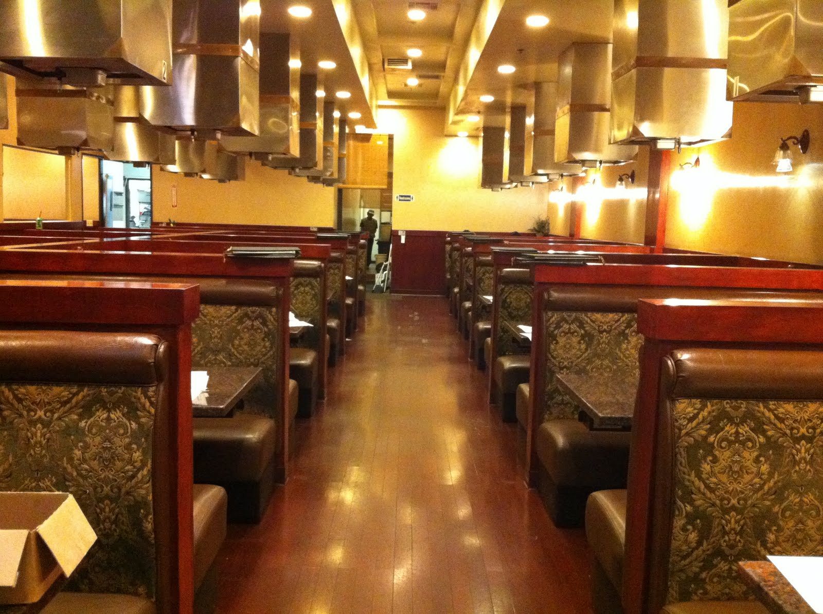
Case Study: Biology Building at Orange Coast College
I am sure everyone has passed by the three large black bricked buildings that have been peering over the fences at the OCC campus these past few semesters. These buildings are the newest edition to the Orange Coast College campus that will house the Allied Health, Biology, and the Consumer Sciences areas of education making up the 53,000 square foot project known as the ABC Buildings. Although the actual construction of the buildings began in November or 2008 the planning for these new additions began twenty years ago as a part of OCC's Vision 2010 which started this 49.3 million dollar project in hopes to modernize the campus for its future. This project was made possible by the designers, planners, and architects of LPA, the most integrated design firm in California that prides itself in making sustainable design possible for each and every project under their name. They believe in integrating green and sustainable design at the beginning of each product to make sustainability part of the project's DNA instead of just simply labeling it a "green" building. All construction aspects will be headed by C.W. Driver known for their upstanding work that has spanned over 90 years of hard work and dedication. C.W. Driving has a reputation as leaders in General Contracting and Construction Management making them ideal for the new innovations we will soon see come to life at our own OCC campus. We can look forward to seeing the finished product in the Spring of 2011. It is a definite honor for current students to see these buildings finished and ready to be used for many years to come.

Essentially the finishes and products used in each of the three ABC Buildings are the same ranging from color to color throughout each building. I will be focusing on the largest of the three projects, the Biology Building which is located on the northwest side of the project.
The proper flooring in a project like the Biology Building is vital to creating a safe and healthy environment for students and teachers. The lab areas must have proper flooring that can withstand many years of experiments and chemicals to come. One of the main flooring products used is made by a company called Dur-A-Flex thats specializes in commercial flooring.

Dur-A-Quartz Epoxy Floor
Color: Q28-21
Dur-A Quartz's motto is "functional flooring with a flair." The product is made up of color quartz aggregate and a Dur-A-Glaze epoxy binder that makes this flooring 5 times stronger as concrete and much more durable. It is a non-porous surface that can withstand stain, shock, high traffic, harsh spills, and chemicals making it a perfect solution for science classroom flooring.
Additional flooring that will be installed throughout the project mainly in the classrooms will be Recycled Rubber Flooring. Their goal is to bring "alternative materials to interior spaces" by providing a recycled product to not only make the market better but to also provide better products for the environment.


Atmosphere Structure Pattern
Color: Stealth
The top picture is an example of an installed Atmosphere recycled rubber flooring that was placed in a sciences setting to give an idea of what the floor might look like. The below picture is the actual color that will be used in the Biology Building.
In Biology Room 101 a new innovative design will be implemented to enhance the learning experience through design. The company WallTalkers has made a floor to ceiling and wall to wall washable communication surface that will make bulletin bards and white boards obsolete.


WallTalkers Tac-Wall
Color: Charcoal
This innovative design is resilient and self healing making it appear new for years to come. It is made of almost all natural materials such as linseed oil and cork making it fit in well with the mission to provide sustainable design for this new building.
Laminates are a huge aspect of the design for all three of the ABC Buildings including the Biology area of design. All laminates are manufactured by the Formica company and will be used on surfaces such as countertops and lower and upper cabinetry. Formica is also a sustainable company that only sources certified wood and recycled content raw materials while they continue to research further alternatives to making their company more green.


Formica Laminate
Color: Storm

Formica Laminate
Color: Natural Cane
The Stone Laminate will be installed to run vertically using a Sculpted finish to create texture and enhance the visual appeal of the cabinetry. The Natural Cane Laminate will be used in all other cabinetry applications for upper and lower cabinets.
Most of the walls will be covered with Frazee Paint ranging from neutral creams to crisp whites giving the building a very clean atmosphere which is an ideal application for science. Other than paint vinyl wall coverings by Koroseal by the RFJ International Corporation will be used throughout the space to give the building more texture while still keeping the environment clean and concise.

Koroseal Shell Buttons
Color: Palau 8221-83
Koroseal is Greenguard Certified meaning the product was approved to prevent moisture from seeping into the product creating mold while also enhancing air quality by not giving off harmful emissions from the chemicals used to create the product.
Other products used in the building which I am interested to see once the buildings are finished are the ceramic tiles that will be used throughout the building along with rubber tile flooring by Johnsonite. Each of these products is a step towards more sustainable design, and I am so excited to see everything come together to create this space. These are just a few of the products chosen to created by LPA to create a healthy and safe learning environment for the Biology and various other science students that will be spending their time experimenting, investigating, and furthering their knowledge of the world that is around us. The hope is that this new environment will enhance the students excitement of learning and discovering new things in the world of science.
By: Carly McBride
Bibliography
http://www.coastreportonline.com/articles/2010/02/24/campus/campus0973.txt
http://www.lpainc.com/
http://www.cwdriver.com/projects/projectDetail.php?pID=226&ps=biomedical#imagepos
http://www.tomkt.com/aboutus.html