Tuesday, April 24, 2012

Twisted Vine Wine Bar


Blog by Ashley Wetterstrom

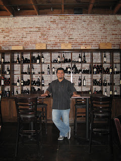
Front Entrance


Step into another world at the Twisted Vine wine bar and store in downtown Fullerton, California.  The space is located on Commonwealth Ave between Harbor Blvd and Malden.  Owners Chris and Jessica Castillo opened the doors of their marvelous wine bar in October, 2006.  You can stop by to purchase wine, Belgium beer and accessories or stay for a delicious dish paired with incredible wine.  Designed by the Castillos, the Twisted Vine exemplifies elegance through simplicity. 

The existing space was used as a storage room for the neighboring Ace Hardware store.  The entire place, including the back patio area, was gutted and prepped for ten months of construction.  The plastered walls were chiseled, power washed and sealed to expose the underlying brick surface.  The concrete flooring was acid washed and then sealed in earth tones.  After power washing, the structural wood exposed ceiling was revealed.  Utilizing several original surface materials created a rustic palette for the wine bar.

Concrete Flooring

Original Brick Wall


West Wall Wine Cabinetry
The alder wood throughout the bar resides as the surface of the bar top, creates the cabinetry, and lines the space in wainscoting.  Monty Aldrup of Cabinets by Monty completed the stunning built-in woodwork in the Twisted Vine.  A large portion of the west wall is dressed in alder wood cabinetry containing hundreds of bottles of fine wines.  The alder wood wainscoting covers the lower walls and leads down the hallway to the covered patio.
Wainscoting / Hallway to Back Patio

Some other surface materials chosen for the Twisted Vine include porcelain tile in the restrooms and slate flooring on the back patio.  The remaining wall space was painted a travitan shade in eggshell finish, offered by Frazee Paints. The tabletops were made out of the insides of wood barrels and then finished in red and brown hues.  The use of dimmed lighting and candlelight generates a precise contrast between the bold and subdued earth tones on display.

Interior Wood Barrel Tabletops

The architectural focus of the exposed structural wood ceiling displays the height of the space.  The original wood was power washed and sealed at minimal cost.  The longitudinal floor plan allows for intimate settings within sections of open space.  With warm colors and minimal accessories, Chris and Jessica have patented an environment that relishes in relaxation and a treasured escape from everyday life.

Intimate Seating


Note from the owners:
My wife and I decided that Fullerton was missing something.  So in October of 2006, we opened the Twisted Vine. We love going to wine country and our inspiration to open up a wine bar was our desire to bring a little bit of Napa Valley to Fullerton.

We wanted to create a classy environment without being stuffy.  Our unofficial business model is fine dining service without pretension. We feel we accomplished that with our design plan. We basically took the existing building and exposed the beauty of the structure without adding
unnecessary fluff. 

The walls were exposed to their original brick, and the original concrete floors were stained in earth tones to create a warm, comfortable environment.  Leather furniture and dark woods, with minimal lighting create a rustic setting reminiscent of old wine country. 

We want everyone to feel like they are in their own homes. With our customer service, food and ambiance, we feel we have accomplished that.

                                                  ~ Chris and Jessica Castillo

Wednesday, April 18, 2012

Environmental Nature Center, Case Study #2

By:  Kacey Curatola
Gradually developed out of the need for  a natural place for students to be able to learn about “real nature” , the ENC or the Environmental Nature Center arose.  The seedlings for what was to become a Platinum LEED certified building were planted in 1972 when what was once a dumping area and a hodge-podge of miscellaneousness was thought to be capable of being something beautiful, educational, and native.  Due to a small budget, Robert House, coined the term patience as being the main reason success was achieved.
Located at 1601 16th Street, Newport Beach, Ca, the Environmental Nature Center was created with the cohesion of responsibility and teamwork of LPA Inc., Gentosi Builders, Culp & Tanner ,  and Griffin Structures, Inc.  It is a 9,000 square foot building on a 3.5 acre site. The 15 on-site plant communities of the ENC highlights indigenous California plant life species, most of which have low water-retaining qualities suitable for droughts.  This naturally aids in the conservation of water.  This drive to use native Californian plant life along with the commitment to nature conservation is what led to the ENC vision becoming a reality.
The most obvious choice for the building of a sustainable building would have to be LPA, Inc., which is a leader in the building of LEED-certified projects.  LPA was founded in 1965 and has extensive experience in public and private architecture and designs a diversity of facilities that span from K-12 schools, colleges and universities, to civic, corporate, religious and retail establishments. They believe sustainable design can be achieved on any project, budget, building type and location. The LPA team in chard of the ENC project was: Jim Wirick who served as principal in charge, Rick D’Amato who served as design principal, and Dave Duff who served as project manager.  LPA services for the ENC involved planning, design, programming, architecture, landscape and interior design services. 
Lake Forest, CA-based Culp & Tanner served as the structural engineer.  “Douglas Tanner founded Culp & Tanner’s Chico office in 1972. As a result of quality people, quality design and quality service, Culp & Tanner Chico, has emerged as a leading firm in the structural engineering community. Licensed in 35 states and with the addition of an office in Las Vegas, Culp & Tanner Chico is able to tackle projects anywhere in the US. Today the staff of 24, operates under the leadership of a second generation principal; Rory Rottschalk.” 

GentosiBuilders acting as the general contractor has been building since 1946 and does construction consulting and litigation support including expert witness services are provided for commercial, industrial and residential construction law cases. 
 It was a group effort to get the Environmental Nature Center built. The concept of this building was to further emphasize the commitment to nature that the ENC has.  Every facet of this building must have sustainability at the forefront.  Alongside LPA, Inc., Griffin Structures, Inc. provided program management. It has locations in California, Nevada, Arizona, and Italy. Griffin Structures, Inc., has a self-declared reputation of being an industry leader of successful project management for nearly thirty years.  They consider themselves to be a trusted advisor for the successful delivery of projects. 
“Sustainable features include: optimized building orientation; bicycle storage and shower facilities; drought tolerant, indigenous landscape; fixtures that promote water conservation - such as waterless urinals and low-flow faucets; efficient storm water management and daylight harvesting.
Photo-voltaic roof panels convert light into power and provide for 100 percent of the building's power needs making the ENC a "net zero" building, a new model for sustainability.
Guests enjoy natural ventilation without the use of heating and/or air conditioning, dimming systems and occupancy sensors, an aggressive Sustainable Education program, heat island reduction, and green housekeeping techniques and products.
The extensive use of recycled and recyclable materials includes: insulation made of recycled blue jeans; natural linoleum for countertops - 100% organic and recyclable; composite wood for exterior skin made from saw dust and natural resin; pressed organic materials for millwork and shelving units; natural concrete; carpet tiles with high recycled content and recycled fabrics/finishes for furnishings and work stations.” . Quote Link to Article
           
Natural Denim Insulation: Bonded Logic, UltraTouch Natural Cotton Fiber Insulation


Recycled Material Carpeting: Shaw Contract Group, Malang Modern Mace carpet tiles

Siding and Fences: Trex Accents decking material [www.trex.com]


Countertop at reception desk – Aristech Acrylics LLC, Avonite Surfaces,“Palm Desert” 


Dual-Flush Toilet: Caroma USA, Caravelle 270 Elongated

LA Fitness Total Gym, Mission Viejo, Ca

By Adriana Doberstein and Zenna Jenaldi

We started this project with a hypothesis; a health club can be built with sustainability in mind! This project was a very interesting choice. We needed to find a facility recently built and verify if the materials chosen to build it were eco-friendly and sustainable. This was our challenge, one that we were eager to test. The one chosen was the LA Fitness Facility located in Mission Viejo, Ca.  Its opening day was September 17, 2011.

About LA Fitness
Founded in 1984, LA Fitness is one of the fastest growing sports club chains in the United States and presently has over 360 locations in 21 states and Canada.
This LA Fitness Gym was a massive undertaking. The largest one constructed west of the Mississippi River, with an amazing 62,000 square foot facility in the newly redeveloped Alicia Towne Plaza, on Alicia Parkway, which is owned by the Watt Commercial Properties.
Some of the features are: full court basketball, six racquetball courts, a 25 yard three lane lap pool, a whirlpool spa, spacious locker rooms with showers and saunas, a group exercise studio, and a separate multi-tiered indoor cycling room. It also includes over 125 pieces of the latest generation cardio equipment with individual viewing screens, selectorized circuit training, and free weight areas.


As one enters the main doors, one can immediately sense the immensity of the space. It gives a feeling of infinity, as one looks forward over the front desk area and upward, toward the skyline on the ceiling. The feeling of spaciousness and high quality surrounds it.


The front desk is very stylish and modern. Wilsonart Laminate is used for the counter top. It contains a minimum of 20% post-consumer recycled content – the highest percentage of post-consumer content in the industry. It also uses FSC Certified Wood–which contains Low-Emitting Materials. This product exceeds the industry’s highest standards for Indoor Air Quality, with GREENGUARD® Certification on all laminate types. Pionite Plastic Laminate with GREENGUARD® Certification is used to complete the look as the side panels of the front desk.


Glass Blocks-Premiere Series from PPG are used as a decorative barrier between the entrance way and the pool area in conjunction with the glass panels. It has a fine grid of closely spaced ridges which moderate light transmission versus maximum privacy. These glass blocks have the Highest Insulation and Sound Transmission Ratings.
The paint chosen throughout the facility is Glidden Professional Paint which meets a long list of regulations that take safety and the environment into consideration. It meets the most stringent VOC legislation nationally and contributes toward satisfying LEED credits. Glidden also focus on getting their paints to meet current MPI, GREENGUARD® and CHPS guidelines, as well as try to anticipate future requirements. Their paint reduces VOC, eliminates waste, and minimizes carbon footprints.
Dal-Tile Gauged Slate feels the eyes and meets our feet as we enter the main lobby. It may not be as sustainable a material as we desire, but it is long lasting and durable. Replacement is not foreseeable in the near or even far future as a matter of fact.


The pool area can be seen from the moment one enters the Gym. The feeling of relaxation invites us to come in and feel its waters. The tile mosaic looks like the sandy beaches of Southern California, with seashells gently spread across its surface.

Daltile does a great job, with its Mosaic Tile Series (OLEAN TILE Keystone Shapes, Unglazed & Blends Series) which contains Pre-Consumer Recycled Material. It is one of the most environmentally friendly building materials you can buy today.
Photos of tiles provided by Daltile


Once one reaches the spinning room one is filled with an immense sense of power, as if we were the Energizer Bunny, and could go on and on and on…..!  The spinning Machines stand side by side as sentinels awaiting instructions, ready for battle.

Armstrong Sheet Vinyl Commercial Flooring is used throughout on the spinning floor, treads, risers and general utility areas and Kid’s Club area of the club. Armstrong uses the USGBC LEED definition – “Material considered being an agricultural product, both fiber and animal, that takes 10 years or less to grow or raise, and to harvest in an ongoing and sustainable fashion.”


Rubber flooring from everroll® is used in the free weights area It is manufactured using a combination of different elastomers which give it a unique level of wear resistance and flexibility. It is made of recycled material such as tires.


 The stretching area of the gym is very spacious, with plenty of room. I have never seen one as big as this one before. The entire floor area makes use of the Pacificrest Mills Commercial Carpet- Big Sur Collection-Patterned Loop- Looped, CRI Certification, Pattern repeat, Ultron type 6,6 Nylon fiber, Piece Dyed. LEED Certification, Carpet Reclamation, Recyclability of Type 6,6 Nylon. This carpet is used throughout the facility.
On the ceiling throughout the facility we have Armstrong- Acoustical Ceiling Tiles 2 x 4 Fine Texture/White- Clean Room VL870-Ideal for up to Class 100 clean rooms, nonperforated Clean Room VL resists initial soiling while providing a scrubbable vinyl surface. HumiGuard Plus no sag performance, and available with high light reflectance options. Perforated VL offers good sound absorption. Both are nondirectional.  Total Recycled Content: 38%- anti-microbial
Potential LEED Credit Area Contribution:
·        Low-Emitting Materials
·        Renewable Materials
·        Regional Materials
·        Recycled Content


It was a pleasure to do this project.  We hope you have enjoyed it as much as we did! 
We would like to thank Lea Roelle, Operations Manager LA Fitness, Mission Viejo. For your support and enthusiasm, your help was deeply appreciated.

Last but not least, our sincere appreciation to Michele Cardon from the OC Register for granting us the rights to use the pictures from their story from August 16, 2011, which can be found at this link 

The Depot Walk, City of Orange

By:  Nancy Ayala & Megan Balderrama
Our Case Study research was on The Depot Walk which is located in the City of Orange. The Depot Walk project was created by USGBC chapter which adopted many of the sustainable green building and development practices by using a variety of recyclable and renewable products and makes it more eco-friendly to the environment. USGBC used the idea of using five key areas of human and environmental health in these apartment lofts which include: sustainable site development, water savings, energy efficiency, materials selection and indoor environmental quality.


The Depot Walk is LEED certified homes which were built to help preserve our environment.  It is actually the first LEED certified residential development in Orange County.  Located in the historic Old Town Orange, the Depot Walk is just walking distance to a variety of restaurants, art galleries, and antique shops in the Orange Circle.  It is only within four miles to the Honda Center, Disneyland, Angel Stadium, and The Block at Orange.  Depot Walk got its name for being in such close proximity to these shops and being right next to the Orange Metrolink train station. (Fig.1- walking distance from metro link)


This lowers the usage of commuting by car which reduces their greenhouse gas emissions and offers a quick commute to Los Angeles and San Diego.  As partners, we believe that this project had good intention regarding fuel emissions because with the gas prices nowadays its costly to commute on a daily basis, especially to either one of these areas. The downside of that is that you have to live with the noise of the metro link.      
The Depot Walk was constructed by the Olson Company and designed by WHA (William Hezmalhalch Architects).  The philosophy of WHA is “best characterized as a seamless integration of physical land planning and cutting-edge architectural design that is tailored to the land, environment, community, consumer-market and our client’s objective.”  Each townhouse is either two-story or three-story and between 1,227 and 2,010 square feet.  They include a two-car attached garage and private patio made of concrete.  This allows water to run through the surface straight to the ground below which reduces water runoff in the storm drains.  (see fig.2 below)
(fig.2)
There are 32 units in the Depot Walk consisting of 10 different floor plans.  Bamboo and cork floors were chosen for their renewable qualities; and CesarStone countertops in the kitchen and bathrooms which are composed of 90% raw materials.  Cork floors are a naturally renewable product that also helps with the sound acoustics of a space.  This was a good choice for this project since these homes are attached to another.  Ventilation and exhaust systems were built to minimize heat loss and particulates in the airs. Recycled brick is used in some of the walls of the town homes and mezzanine areas. 


Dual pane windows made with 20% recycled aluminum and LowE2 glass increase the insulation in order to keep the homes cooler during the summer and warmer during the winter.  Solar panels span over the roof of each townhome that provide up to 50% of their electricity. Although, the initial price to install solar panels is high, they provide a free source of electricity and over time they pay off.  Residents even have the ability to see the exact percentage of electricity being used from these solar panels.


 During construction, between Spring 2007 and Fall 2008, waste levels remained below 10% for the entire project.  This is an incredible feat for a project built from the bottom up. The landscape provided uses low to moderate amounts of water and the irrigation system is linked to the local weather which means it is only used when necessary.  The trees placed on the South side provide shade to the units thus reducing energy costs for cooling the homes. The trees are also placed to shade concrete and asphalt, which tend to store and reflect the sun's heat.


In the bathrooms dual flush toilets are used which can reduce the amount of water used per year by more than 60%.  Another way water usage is reduced is with low flow shower heads and faucets with low flow aerators made by Kohler.  This alone, can reduce the water usage by 20-30%.  Tankless water heaters provide hot water to the units instead of the traditional water heaters.  These are efficient, however, not very economical.  Electrical outlets are needed, as well as gas pipes and a different ventilation system. This can be around four times the cost of storage tank models. It is also recommended that these tankless heaters be serviced at least once a year by a certified technician. Last and not least, The Depot walk practices a non-toxic termite control to make the environment be more sustainable and healthy.
Overall, the materials and products used to build these homes were successful in helping to create a sustainable indoor and outdoor living environment.  So much so, that they are LEED certified Silver.

Resources:

Friday, April 13, 2012

Eames House or Case Study House No. 8

By:  Megan Chupco
 
The Eames House was conceptually designed, created, and built by Charles Eames.  The house is designed on a 150 foot cliff side in Pacific Palisades overlooking the Pacific Ocean and is designed to withstand the moist environment.  When developing the building they wanted to keep nature in mind, there theory was “1. Not destroy the meadow, 2. Maximize volume from minimal materials.”  They developed the residential building in an area surrounded by eucalyptus trees.  The construction used a variety of materials from a concrete foundation to glass, stucco, wood, and metal for the walls and an asphalt roof all composed on a steel frame.  The building creates a grid like pattern from the steel frame, they even emphasize the grid on their furnishings, and façade, ornamentation, glasswork and textiles (Photo at end of paragraph).  The design creates an industrial structure that creates straight lines with 90 degree angles.  The building creates a sense of uniformity through the different uses of planes solid, opaque, or translucent.   Charles Eames created a simple color palette with the use of strictly primary colors to be used throughout the house internally and externally.  


Photo Courtesy by MC Mr. E. © MC Mr. E, available exclusively through Artifice Images

The building is primarily an open plan with the ability to flow from one space to the other in an easy transition.  The exposed ceiling composed of Ferro board decking caused eye directional movement from one end of the building to the other by creating length.  The Eames did use a divider to differentiate between the kitchen and dining area; they used a modern fold door. The entrance and living room are informally divided by a storage area composed of metal doors and the spiral staircase, Eames created a sense of separation without actually dividing the space.  A product they used through most of the house was Factrolite which is a crystallographic type of glass used in the entrance and bathrooms.

Materials
Charles Eames wanted to create a space with minimal materials and was able to combine them all in a visually appealing sense. Several types of materials used as follow:
  • Sharply pleated linen and rayon fabric drapery in a natural color by Deering Milliken
  • Factrolite by Mississippi Glass Company
  • Voit Rubber Tile in a Sea Sand color
  • Prefabricated Metal Doors by Republic Steel
  • Cemesto Panels painted in the primary colors (red, yellow, and blue)
  • US Plywood bird’s eye maple (ceiling)
  • US Plywood Walnut (walls)
  • Enameled metal cabinets
  • Marble Countertops
  • White Linoleum tiles
  • Translucent Plyon
The use of these materials not only created a sense of harmony and pattern but they were repeated throughout the residence creating a common domain and not being sporadic.

Photo Courtesy by MC Mr. E. © MC Mr. E, available exclusively through Artifice Images

Charles Eames was very talented and not only designed his wife and him their home that they would live in but he designed all of the furniture that furnished the residence.  In the living room he created a built L-Shape sofa along with wood shelving and upper storage cabinets.  They furnished the house with their famous Eames Leather Chair and Ottoman along with their Molded Plywood Lounge Chair.  The furniture maintained that same schematic design of being on a grid with straight 90 degree lines.  The Eames family was extremely on the artistic side and therefore displayed many work of arts by Hans Hofmann to expose contemporary art that was relevant to their style of furniture.

Photo Courtesy by MC Mr. E. © MC Mr. E, available exclusively through Artifice Images

The Eames House is Case Study House No. 8, it was one of the most successful houses out of the 24 that were designed conceptually or actually built.  Being able to start from one idea and transform that idea into something far different than original plan and turn out so harmonious is an excellent accomplishment. I believe the use of materials and craftsmanship that was put into this house made the design come together as an entity.  The Eames house has to be one of my favorite pieces of design both internally and externally.

Resources

Medical Office-Burnham USA

By:  Andrea Lucks Collins
Medical Office 
Burnham USA

1731 Santa Ana Avenue
Costa Mesa, CA 92627
949.760.9150


I researched a local medical office that is being constructed in Costa Mesa, CA.  It is a single tenant first floor medical office building with 2,200SF. The property is currently undergoing building and landscape renovations.

Burnham USA’s executive management team are experts in all phases of commercial real estate including construction, leasing, and management. The team offers to each project a full spectrum of real estate capabilities including market research, acquisitions, planning, development, finance, construction coordination, leasing, and asset management.


Site Plan


 Cedar Paneling

Products/Materials Used

       Cedar wall sheeting was used over half the building
       Pressure treated wood used for the walkway
       Concrete for walkway and part of construction
       Modified Bituminous Roofing paper used for roof
       Aluminum Siding
       PVC  Piping for water sprinkler system
       Glass windows and doors
       Hardware for doors
       Beautiful plants for landscape


 Back Entrance

 Cedar
Cedar is sustainable and has many different types of species; such as: western red cedar, cedar, red cedar, and Canadian Coastal Red Cedar which are all known for its fine texture soft wood, fresh fragrance, and broad natural colorings and grain patterns, stability and natural durability characteristics. Some of the primary uses are: weatherboards, fascia, paneling, pergolas, handrails, specialty moldings, joinery, and furniture.  The colors of cedar range mellow ambers, reddish cinnamons, and rich sienna browns. The color is complimented by fine-grained texture with a satin luster.

Cedar is much more weather-resistant than other varieties of commonly available lumber. Among little limitations, cedar does not finish well with paint due to the richly grained wood.  Cedar tends to have a lot of expansion and contraction depending on the season. It is also naturally insect and rot resistant, and while it does move a lot seasonally, it doesn’t splinter much over time. It is also water-resistant, and doesn’t require any treatment before being used outside. Cedar walls also have acoustic properties to help quiet rooms.


 Front Walkway

Pressure Treated Wood
Pressure treated wood ensures a long life of wood under natural earth conditions that wear and tear wood. There are different chemicals/preservatives and processes that extend the life of wood, which gives the wood its resistance from being destroyed. Treatment for wood has been practiced “since ancient Greece during Alexander the Great’s rule.”
There have been different hazards previously that have now been sanctioned by the US Environmental Protection Agency as illegal. These chemicals had arsenic and chromium, which are fatal. The overall use for pressure treated wood, is to sustain harsh conditions, and generally used outside.

Concrete
Concrete is a composite construction material composed primarily of aggregate, cement and water. There are many formulations of concrete with varied properties. The aggregate is generally coarse gravel or crushed rocks such as limestone, or granite, along with a fine aggregate such as sand. Concrete is widely used for making architectural structures, foundations, brick/block walls, pavements, bridges/overpasses, motorways/roads, runways, parking structures, dams, pools/reservoirs, pipes, footings for gates, fences and poles. Concrete was invented by the Romans. Concrete is also recyclable, and is in general very inexpensive.

Modified Bituminous Roofing paper
Modified Bitumen roofing is an asphalt-based, close cousin of the Built-up-Roof designed for buildings with low-slope or “flat” roof structures. Engineered modified bitumen roofing membranes originated in Europe in the mid 1960's and have been used successfully in the United States and Canada since approximately 1975. It has increased resistance to brittleness during cold temperatures, greater flow resistance at high temperatures, and increased elasticity can be achieved by blending synthetic rubberized polymers. The benefits from using Bituminous roofing paper is that its water resistant, broad range of application methods, available flame-free and VOC-free installation, and is part of a fire, wind, and/or hail rated roofing system.

Aluminum Siding
Aluminum Siding is used as an alternative to wood. It can be painted any color and can be found in a wide range of vertical and horizontal sidings. It is known for its durability and ease to maintain. Aluminum siding on this building is the outer covering or cladding, which is meant to shed water and protect from the effects of weather. It acts as a key element in the aesthetic beauty of the structure and can really influence the property value in addition.

PVC Piping for water sprinkler system
PVC Piping, also known as polyvinyl chloride. It is the third most widely produced plastic. It’s widely used in construction because it’s durable, cheap, and easy to work with. Depending on different plasticizers used, the plastic can be made softer and more flexible. In this instance, it’s being used as piping for the water sprinkler system.

Glass
Glass is an amorphous (non-crystalline) solid material. It is typically brittle and transparent. Glass is used in the office for the windows, and front and back door.


References

       http://burnhamusa.com/


The Crossing, Costa Mesa California

The Crossing, Costa Mesa California
By Jaytee Salas & Lacey Gonce

Photo Credit- John Ellis
The Crossing is a non-denominational Christian church that is anything but traditional. Although the church has been around for over 24 years, their new location on Newport Blvd. & Victoria Street was completed in spring of 2011. Our first impression of the exterior is that it is very modern with steel & aluminum finishes, bright complimentary colors of blue & orange, and roll up garage doors along one side. It is very different from a “typical” church with high cathedral ceilings & stained glass windows. Once you are inside the courtyard you get a much more serene feeling. The courtyard has the brightest green grass I’ve ever seen, steps cascading to the second floor, inviting you to sit down & stay awhile. A beautiful, crystal clear, reflecting pool, which you hear before you see, adds visual appeal and is also used for baptisms. With all the new additions & beautiful features surrounding us, we decided to focus our attention on their new auditorium which covers 22,000 square feet & has three levels. 

Photo Credit- John Ellis
The Crossing sought to create an auditorium that captured their unique style of devotion, a space that could relate to their audience in a way that was familiar, relevant, and modern. The staff at the church worked with church member, Scott Laidlaw of Laidlaw Schultz Architects to design the new auditorium & surrounding courtyard area. We were very fortunate & extremely grateful to sit down with Scott’s partner Craig Shultz at their firm in Corona Del Mar. There we were able to learn more about the design process. We took a closer look at the specifications & materials chosen for the interior & exterior. Also, we got a hands-on look at all of the plans that were used throughout the design process. We learned that the church got its inspiration from the way Hard Rock CafĂ© is designed. They wanted an intimate yet rockin’ venue that could integrate a high tech production, but still allow everyone to feel close and connected to the people on stage. 

Photo Credit John Ellis
To accomplish that modern look they incorporated features such as glass & aluminum roll up garage doors, amphitheater seating, clusters of pendant lights with a heart of metal trumpets incased in a body of glass & chic smooth concrete flooring, to name a few. The design team seemed to keep every member of the church in mind with special features such as, a Cry Room, where moms could nurse their infants behind a one way glass window in comfortable rockers while still being able to participate in worship. The entire auditorium is set up with ample ramps & handrails throughout creating barrier-free passages. Built in bookcases were also incorporated to provide members extra bibles just in case you forgot yours. 

Floor Finishes
1.    Entry way and Mezzanine Level:  A Concrete Waxed (CCWX) with natural stain
2.    Lower Level: Vinyl Tile (VT HP) manufactured by Kamdean International, Renoir Plank Flooring, Hickory Pine (REN112), (http://www.karndean.com/)
3.    Cry Room:  Carpet Grey Broadloom (CPT GRY) manufactured by Constantine Commercial Carpets, style- trace, fiber- 100% Antron Legacy Nylon, color- Appalachian Trail (C226L27), (http://www.millikencarpet.com/en-US/company/Pages/default.aspx)
4.    Courtyard:  Ceramic Tile (CTMX) manufactured by Daltile, Keystones unglazed mosaic, 1 x 1 in varied neutral colors [D014 Accent; D026 (40%); D140 (20%); D311 (20%)], (http://www.daltileproducts.com/

Wall Finishes:
5.    Interior Paint Typical on all Plastered Walls: Paint Dark Blue (PT-DB [E]) manufactured by Dunn Edwards, Interior Latex Enamel Eggshell, color-Deepest Sea (DE5825) (http://www.dunnedwards.com/)
6.    Interior Wall Paneling:  Duct Liner was strategically used on some of the building’s interior walls to create the acoustical effect the designers hoped for.  To achieve aesthetic appeal Douglas Fir wood slats and a few built in display cases were placed over the lining. 
7.    Exterior Wall with Metal Paneling: Corrugated Steel (MTL-CO), manufactured by Corrugated Metals Inc., Kynar 500, 4in. Box Rib (http://www.corrugated-metals.com/)
Lighting Fixture:
8.    Mood Lighting on Mezzanine: Miles Double Suspension Pendant lights by MODISS, carved transparent crystal shade, satin gold metal, and red textile wire detailing (http://www.modiss.com/)
Seating: 
9.    The seating in the mezzanine area is designed like a stadium or movie theater with cushioned folding chairs. The lower level of the auditorium was designed to be multipurpose area with removable seating.  The chairs used in this area were reused from the church’s previous building and a modern, black, linking chair.
Exterior Element:
10. Garage Doors: Roll up garage doors installed by Certified Door and Dock Equipment, glass aluminum roll up sectional doors (http://www.certifiedohd.com/projects/products/details/?p=23)

The opportunity we had to work with an experienced architect and view first-hand the design process was extremely exciting and educational.  We highly recommend that design students take the time to visit The Crossing to see a marvelous architectural and interior design project done well.  Overall they achieved exactly what they were looking for, a modern, stunning & most importantly inviting place of worship.

Cited Information:
Laidlaw Schultz Architects- 3111 Second Ave, Corona Del Mar, California
The Crossing Church- 2115 Newport Blvd Costa Mesa, California


Twitter Delicious Facebook Digg Stumbleupon Favorites More

 
Powered by Blogger