Wednesday, December 2, 2015

Milk & Honey

M + H: A Place Where Dreams Come True & Tummy’s Leave Happy
by Xitlalmina Alarcon
If you need a quiet little spot to hangout, do homework, or a little office space, Milk + Honey is the place to go. 
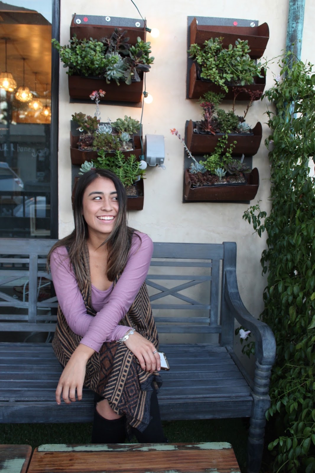
Pulling up to the Organic Tea and Coffee shop is a treat to the eye immediately.  With a big umbrella casting shade over the outside seating area, and the green plants hanging from wall to wall, the tiny baby succulents creeping from the corners and the astro turf we’re gifted a little extra umph to this location, leaving you feeling refreshed.  The modern, rustic furniture in the front grabs your attention as well as gives a little bit of edge to the plants and green surrounding the space


Upon walking through the door I immediately notice how open the space is AND not to mention how green! The spacing of furniture is quite satisfying for this coffee shops design aesthetic.  The left wall walking in warms the room with a nice purple ombre glow, along with a beautiful semi-sphere centered in  the middle of the wall covered with grassy, moss complimenting the purple wall it rests on.  (Rumor has it the owner is planning to add shelves to the wall as well)
The furniture leans toward being very modernized rustic, industrial.  Cool browns, dark greys and white are the primary colors.  There of course is color that is thrown in with the little decorations, such as mini succulent pots, mocking cute little sculpted figures. Oh and lets not forget about the chalkboard that you can draw all over-- how fun! I LOVE how they added these little fun friends, not to mention the adorable sown cactus that is practically life size!  SO cute!


The light fixtures vary.  Above the register area there are beautiful pendants hanging, illuminating the space.  Directly above the bar are very bright (a little too bright…) pretzel shape, exposed bulbs hanging.  Overall the lighting of the store achieves bringing in just the right amount of lighting and does not take away from the relaxing feel.


My favorite part of the whole shop is late at night when the twinkle lights are switched on-- making you feel right at home, leaving you relaxed and comfortable while enjoying a warm cup of coffee.

Tuesday, December 1, 2015

A Case Study: Target


Presented by Joanne Aartman and Rabeeh Ahmadi
Our case study takes place at Target in Huntington Beach, CA on Brookhurst and Adams.  We decided to study this location because it is a new building (built in 2010-2011).  Target—in an attempt to compete with Wal Mart—decided to demolish the old building and build a new one complete with a grocery department.  The new building faces east and is positioned in the middle of the shopping center whereas the previous building faced north and was positioned in the north-east corner of the shopping center.  

When entering Target, there are 2 kinds of carpet tiles: the first one looks and feels like a Brillo Pad and is extra absorbent and durable according to a manager.  The second carpet tile is also grey and durable but softer and functions to “clean” shoes as people walk into the store.  These carpet tiles are holding up well and can be easily replaced one tile at a time when needed.

On the walls of the entrance, there is beige vinyl wall covering up to 42” high and then there is paint.  The vinyl wall covering allows for a clean, sleek look that is easy to maintain.  The paint however shows signs of wear and tear.  On the bottom of the wall, there is rubber baseboard.  There are some scuff marks on the baseboard, but it is not very visible since the baseboard is grey.  Overall, the condition of the baseboard is good and it appears quite durable. 

 In the bathrooms, there are 2 types of tile.  One tile is on the wall.  White 6”x6” ceramic wall tile.  And the second tile is 8”x8” ceramic floor tile in beige with black grout.  Both products appear in good shape and are quite durable. 
From the bathroom and the carpeted part of the entrance, customers walk onto white terrazzo tile.  The tile is a good product to use because it looks clean and can also be replaced or repaired easily.  There is evidence of replacement tiles in between display cases and in the new “self” check out stations.

In the women’s clothing section, carpet is used as the floor finish.  It is a grey and red pattern carpet, but it is easy to see the wear and tear on this product, which is interesting because this area doesn’t have as much traffic as the entrance.  

In the Starbuck’s café, café tables and chairs are made of laminate tops and metal bases.  These tables and chairs are holding up well; there are scratches on most surfaces but overall these products appear in good shape for everyday use.  There are 2 colors of tile in the café area both in 18”x18”.  One 18”x18” tile is a ceramic tile made to look like honed Travertine and the other 18”x18” tile is a ceramic tile made to look like walnut-onyx pattern Travertine. 
This case study of Target in Huntington Beach has taught us that many factors go into building and creating commercial retail spaces.  The materials selected matter, need to perform in varying elements, and must be durable.  Without these considerations, a retail space will look not be inviting to consumers. 

Final Touch Bakery in Westminster

Eri Shimada
Aprile Ly
ID150/Fall 2015
We chose the bakery: Final Touch, which had been finished remodeling one month ago. It locates in Westminster. They bake cakes for all type of occasions such as birthday, anniversary, wedding and shower. The store has two sections: front and back. The front is the reception where staff hand out the cakes and discuss with customers about the design of cakes, and tasting room. The back is the kitchen for the bakers and designers work on the cake.
The style of this bakery is rustic.  The main material is wood, which are used for walls, doors, and counter wall. The rough textured wood make this place casual, friendly, and so pretty. However, it has a possibility to hurt customer’s delicate cloth or stockings. Wood is living material, so it’s easy to change the shape, but it was installed tightly to avoid curving up. The constructor might have enough knowledge.


The material of counter top is man-made stone, which is durable and difficult to stain. The color is white so that easy to find dirty. The material is easy to wash to keep clean, so this is the best material for countertop of food store.  In addition, the counter has two level of height, so children or people with wheel chair can access easily. This is good example of universal design.

The floor is coated with epoxy, that creates a nicer look than concrete but not too expensive. The epoxy floor is cleaner than the concrete because it does not produce any dust, and it is easy to clean. The movement of the floor goes well with the rustic look of the wood on the walls.


Inside the tasting room, there are 8 chairs and large table. The chair is consisting of 88% polyurethane form pad and 12%of polyester-fiber batting. Even though it is not a natural material, it’s considered as a sustainable product because it looks durable enough for the customer who use them only weekends.

The area rug is an urban touch for the whole rustic design. The black and white color of the rug stands out easily from the dark old color of the epoxy floor. There is no threshold at the door between the reception area and tasting room, and they have one floor finish for both area.


There is multiple light sources are wrapped around a big piece of wood and dropped from the ceiling straight down to the long table below. They are all Edison bulbs for the vintage look. The Edison bulbs are beautiful and perfect for the whole design, but they use so much energy and make the room’s temperature higher after a period of time. However, there are also some LED spotlights to point at the logo and images on the wall, they are for the focus for some points in the room and they also save up energy.


Disneyland Resort in Anaheim.


Material/Product Research & Case Study Blog Entry 
by Anaid Gonzalez

For this blog entry I studied the recent construction of an area of Disney California Adventure at the Disneyland Resort in Anaheim. In the summer of 2012 a brand new restaurant was built at the center of the park, the Carthay Circle Restaurant. Built as an homage to the Carthay Circle Theater of Hollywood’s Golden Age, it is replicated in the park to serve the thousands of guests visiting each day. Hence the materials and products chosen would have to withstand substantial wear and a lengthy test of time.
First we look at the restaurant’s exterior. The materials utilized in this area are worth mentioning because of the daily guest foot traffic and exposure to the now extreme climates of Southern California.
Just a few months after opening, the terrazzo flooring at the entrance was removed and reinstalled. Now the terrazzo is level and holding its beautiful color and design. Next I’d like to comment on the ivory exterior paint of the building. As seen in the photo,
 the walls and columns are a bit dirty. Unless a flat paint was used, I would like to see some light cleaning of those smudges as they are prominent when one walks up close.
Next up is the clay tile along the side walkways.
 It seems that the clay tile has been treated, glazed since opening. The May 2012 photo on the left was taken the same day the construction walls came down. I deduced then that the appearance of the tile was meant to look distressed due to the time period in which the original Carthay Circle Theater existed, but now it seems that it was always meant to look newer. There is some wear to the tile now, but overall it is holding nicely. The park is rigorously washed and prepared for the next day via power washing and that has probably affected the appearance of the corners of some of the tiles, no cracks however are visible.
Now for the interior lobby. Right away I observed the flooring, baseboards, and paint.


Solid wood planks were not used in this small space, but instead a laminate flooring with a wood-look. A good durable choice for easy cleanup, avoiding scratches and stains, and moisture protection from humidity and the occasional rain that instantly drives guests indoors. This type of flooring is also used in the bar area. I believe the baseboards are made of a composite or engineered wood as an obvious choice for durability and the interior paint is similar in color to the exterior paint. Not much wear to the materials in this space as guest walk in directly to the bar and lounge area. Softer lighting welcomes guests to wait as their table is made ready in the main dining room on the second floor. Wallpaper and carpeting is used throughout, bringing color and texture into the space.
As seen in the photo, the staircase runner is the same as the rest of the carpet allowing for consistency to the second floor. The carpet here does show wear and fading due to foot traffic and cleaning. Other than the elevator, the stairs are the main access way to the second floor, so no surprise this runner may need to be replaced soon. That should be an easy task since this piece only extends to protect the polished black stone. The rest of the “staircase runner” is designed into the stair carpeting. The polished black stone at the base of the staircase is not repeated anywhere else, so perhaps it is used to contrast the lighter tones in the carpeting.
And there we are, a brief analyzation of a few of the materials and products used at the Carthay Circle Restaurant at Disney California Adventure. Overall I believe these were great choices to have made to withstand daily use and not much modification or alteration will be needed in the near future. Durability certainly did not come in the way when trying to replicate Hollywood’s Golden Age either. Step inside and the design details will transport the guest back in time as if to premiere Snow White and the Seven Drawfs as the Carthay Circle Theater did in 1937.
Resources
1. Interior Design Materials and Specifications by Lisa Godsey. 2nd edition.

The Wayfarer


The Wayfarer
By Ally Urias

When the Detroit Bar in Costa Mesa closed last year, local musicians and frequent patrons were deeply saddened.  This had been their go to spot to have some drinks and listen to really good music either from local bands or DJs.  Then new owner Jeff Chon decided he would remodel the place and make an even greater spot for OC residents to not only listen to good music, but eat good food, too.  The remodel included adding a full kitchen, moving the bar and making it bigger and a complete make-over in the restrooms.  Chon wanted there to be better stage visibility and acoustics so he knocked down walls and created vaulted ceilings to make a nice open floor plan. He also added in rustic décor and named the new bar The Wayfarer.


The Wayfarer’s rustic interior fits in perfectly with the atmosphere the music creates, it’s authentic and cozy.  It’s really big and open, you can see the stage from anywhere in the bar.  The walls are painted light blue and alternate between wood paneling and brick walls. This works well with the space because it is not all the same, mundane thing.  It gives the bar variety and makes it edgy.  The floor is all concrete that has been dyed a dark yellow, which makes spills easy to clean up.  I love that it had different sources of lights.  To begin with, there were white little lights hung up across the ceiling; recessed lighting lit up the stage area and different chandeliers and hanging lights were used across the space.  The décor all has a rustic, vintage feel with lots of metal bars on the table legs and chair legs.  There were red booths against two of the walls in the space, which did not work well.  They looked nice because of the contrast between the wall and the booth, but when I sat down, I sank really low into the seat.  It was uncomfortable and decided to sit at a bar table, which had a more comfortable chair.   The only other problem I encountered was a surfboard hung on the ceiling; it looked really out of place and should be removed. There were also quirky, cute paintings all around.  The walls,  floors, lighting, furnishings and art all work together to create a unique, eclectic bar.

The Wayfarer is a really fun and cheap place to relax and enjoy some good music.  They have daily specials and really good food; I tried out their $10 BBQ Rib Plate and was far from disappointed.  Another plus to this bar is they have added in free games for their patrons.  There are pool tables, Ping-Pong tables, hacky sacks and a jukebox.  The Wayfarer is a really good bar to have a good time, listening to good music and enjoying good, cheap food and drinks.    

Cortinas


By Melissa Hernandez & Paige Anderson

Cortina’s in Orange, CA opened in 2012 to the excitement of the many fans of the original Anaheim Deli. They are located right smack in the middle of a cluster of industrial business parks in Orange and it shows in their architecture and décor. The building is very industrial with rusted colors, and a marriage of metal and wood throughout the exterior and interior.
On the exterior of Cortina’s there are actual rusted metal sheets decorating the lower part of the building, and the wood beams that support the patio and decorate the building mimic the color of the rusted metal. They have drought resistant plants wrapping around the front patio area along with koi pond. The greenery outside compliments the black and rusted colors on the actual building itself, and the pond is a relaxing touch for the patrons who choose to eat al fresco, although it seems to attract more flies and can get a bit annoying.

 Their patio furniture consists of black aluminum tables, silver aluminum BFM chairs, and black table umbrellas that have been there since they opened two years ago. Nothing looks faded or really worn at all, although there are scratches on the paint of the aluminum tables, it adds the rustic ambiance of the place. Even the silver aluminum chairs have retained their shine and look as if they were bought yesterday, so this is definitely a great spec! All of the outdoor furniture gets wiped down every day and gets hosed down at the end of every week so everything is easy enough to clean.

            The marriage of metal and wood carries into the interior as well. They have wood tile floor in a natural beige color and that seems to have held up well against the constant wear and tear of patrons coming in and out. Although the wood tile is durable the texture on the tile seems to make it difficult to completely clean since dirt gets caught in the grooves, so they employees have to go over the floor a couple of times to make sure it gets a good cleaning. At the register the countertop is a granite slab that seems to have etched and chipped in various areas so that may not have been the greatest choice. A quartz might have held up a bit better against so much wear. Then there are the wooden tables which have a finish that is easy to scratch off so it looks like the wood itself is all etched which does not do it justice. Also, the faux leather booths seem to be tearing and ripping in certain areas which can be uncomfortable and not very aesthetically pleasing. I believe it may be a vinyl that mimics leather, but it just seems like such a thin material which would obviously make it susceptible to tear. Most of the walls are covered in reclaimed wood that has not been sealed which does not make it easy to clean and dust since the natural texture is still rough and exposed.

            The décor inside is very rustic with the industrial touches. They have one wall that is entirely concrete with red barn doors decorating the walls giving it a pop of color and warmth. Then there are ropes hanging from the second story metal railing, and they have funky framed artwork decorating the walls along with old farm tools as well which pay homage to the history of the city of Orange.
            Cortina’s is a perfect blend of the industrial style with rustic touches. Many of the products installed have held up well with just a few exceptions, but it still feels very current even though it was opened three years ago. The ambiance is comforting and welcoming even with the industrial feel of the place, oh, and the Italian food and sandwiches that they are known for are more than enough to keep anyone coming back!

Wednesday, May 13, 2015

The Supreme Plate

The Supreme Plate
 
By Laura Dyball
 
 
Since its beginnings as a culinary magazine five years ago, The Supreme Plate has expanded, and become one of the best rated restaurant and catering companies in the greater Los Angeles and Inland Empire areas. The roughly 1380 square foot restaurant, located in Rancho Cucamonga, was originally an Indian spice market, but The Supreme Plate has left no trace of its location’s previous business.

The cool, neutral palette, accompanied by pops of blue, green and orange are a soothing combination, in comparison to the “turmeric” yellow walls (as described by the owner) and brown floor tiles that filled the suite in its market days. The lobby and dining room floors are now covered in beautiful 21 by 21 inch gray-brown Italian tile. Behind the counter and throughout the kitchen, you will find the floors are covered in a custom gray epoxy with black and blue flakes. The walls are all a clean white, which helps the restaurant feel spacious and bright. However, the wall to the right of the counter features a large mural of The Supreme Plate’s logo, adding color and interest to the space.


The owner, Chef “Cheeba” Moscowitz, and Executive Chef “Roc” Thompson, told me that they were involved in every aspect of the remodel. “We did everything ourselves,” said Cheeba. “Disposed of the old materials (including a giant deli meat counter) replaced the old electrical and plumbing, laid the new tiles, painted, and put in all the new stainless steel appliances.”


I found myself really impressed by these two gentlemen’s overhaul of the space, especially since there were no public restrooms in the suite when they took over. “It was all from scratch, the walls, everything.” Now keep this between you and me, OK? The restrooms were hands down my favorite part of the restaurant. Now, I’m in no position to purchase a home or condo (reality of a poor college student), so seeing what was essentially my dream bathroom at The Supreme Plate made me a little envious (no judging). The gray tiles they used for the floor and walls, paired with gray wall paint, made these bathrooms feel extremely modern, chic, and luxurious. The look is something straight out of a design magazine.

I can only imagine that the remodel of this space was a tough project for those involved, but I’m sure you’ll agree with me in saying that the end result is outstanding. I believe this design, combined with their delicious menu, will keep The Supreme Plate a favorite for years to come.

 -All photos and quotes are courtesy of Chef Cheeba Moscowitz.

Chipotle in Orange


Chipotle - E. Chapman Ave., Orange,  CA
Blog post by Heidi & Cheila


Chipotle is undergoing a nation wide remodeling process, that is "wowing" costumers all over the country. Not only does Chipotle offer delicious food, they also have a great eye for design! Recently, the location on E. Chapman avenue completed their renovation.  With eco-friendly fixtures and materials and a creative seating floor plan, the design is both responsible and friendly- and, well, pretty great looking too!

So let me tell you about it,
There is a mosaic of wall panels that adds texture and interest.  Back lit plywood paneling add to the ambiance with striking color and light.  To offset the warm wood walls, stainless steel paneling is strategically used at the drink station and front counter for its look and durability.

LED fixtures are used throughout.  The long linear shape in the dining area gives it an industrial feel. 

The shape of the steel counters is the perfect fit for this space.  It’s inviting for larger dining parties, but configured to give individual patrons their own personal space.

I would say the only downfall to this space is the seating coverings and slippery flooring. Even though their stools are  covered with beautiful natural leather, they are rather uncomfortable.  Although aesthetically appealing, they are neither durable nor easy to clean and are already showing wear.  The minimalistic chairs are no better with their unfinished wood backs and seats.
The grey stained concrete floors are really industrially chic. They are glossy, smooth, but somewhat slippery.

Overall great food, and the space design is pleasing to the eye!
Chipotle, you've done it again.. 

Fig & Olive

Fig & Olive
The French Riviera

Written & Photographed by Haley Moss

             Fig & Olive opened in December of 2013 in Newport Beach, California. It is located in the well-known shopping center of Fashion Island. The restaurant totals at 12,000 square feet and can seat up to 330 guests at one time. They have offered different themed rooms to give individuals a choice of their dining experience. The rooms offered are The Lounge/Bar, The Orchard, The Garden, and The White Room. The Restaurant was inspired by the French Riviera and displays an open concept to bring in the lovely Orange County weather. Most of their inspiration comes from the coastal regions of France, Italy and Spain. For this reason they don’t use any cream or butter and keep their cuisine as light as the space by using only Olive Oils. This restaurant offers a wide variety of options for dining, you can have a very sophisticated evening or come out on a Friday or Saturday and spend the night with a live DJ listening to French Riviera Electronic music while receiving bottle service in the lounge.

Upon entering the restaurant you are greeted with tall ceilings with wooden beams jutting across the ceiling and limestone floors throughout the bar and lounge area. The barstools are made of rich red leather the sit up against the white marble bar counter tops. To display their liquor they have created suspended shelves made of iron and glass.
 
Moving to the next room we enter The Garden/Patio; which has continued with the limestone flooring. There are a variety of different materials used for the tables and chairs. Larger tables are made up of the white marble with a wood laminate trim. The smaller tables are made up of the light wooden laminate and the lounge tables are made up of engineered hardwood. For the structure of the patio they have continued with large wooden beams running both vertically and horizontally throughout the space.

 The next dining room is The Orchard which transitions into a darker wood flooring. The main focus of this room is the two faux Olive Trees they have placed in the center of the room. They have used bench seating for the majority and then used the red leather chairs to complement those in the bar area. The ceiling is again beamed with large wooden beams and the walls have a stucco finish. The suspended lighting fixtures give the effect of woven baskets.

 We then move into the white room, which of course is all white. The flooring is limestone but set in a diamond pattern through the room. The walls are stucco and painted white with three large skylights to bring in as much natural light as possible. The booths are upholstered in white and the chairs are upholstered in white leather with a dark wooden accent. This is the only dining room that uses white linens to offer a more sophisticated dining experience. They kept the lighting fixtures in this room very light and went with glass suspended lights enclosed with iron and then mostly recessed lighting. Both the Orchard room and White Room are lined with rosemary bushes with perimeter lighting to really transport the guests into the   French Riviera and give them more senses to go off of.
 
The restaurant is decorated perfectly to make you feel like you have been transported to the French Riviera, from the materials chosen down to the accessories. The restaurant displays Olive Oils all throughout on under lit shelves and even show the Olive Oil basins which shown what they are produced in. They also have inset displays on the wall that shows what herbs and spices are used throughout their cuisine. The even have a bookshelf lining an entire hallway with books filled with information about the French Riviera decorated with pottery and lighting. The doorways are very large and the one between the orchard and white room feature an archway.

 Overall their material selection was on point. There are a few critiques that I have. The white marble used on the tables does stain very easily. Marble is a very porous material and needs a lot of maintenance to keep it looking top notch. Since this is a place where wine is being drank they tables are left with rings of wine. The flooring throughout the bar and lounge also is a hard place to keep clean. With a very active nightlight on the weekends there are a lot of spills, that happen which leaves a sticky dirty floor that needs regular cleaning. Along with that the rosemary lining the room adds a beautiful touch but is not cost effective since it needs to be replaced about every two weeks.

Twitter Delicious Facebook Digg Stumbleupon Favorites More

 
Powered by Blogger