Tuesday, May 17, 2016

Starbucks Coffee Stores - Fashion Island

By: Zoreh Azarbaeijani

This research is about new design concept for Starbucks Coffee stores. Starbucks was established in Seattle Washington in 1971, and today is operating 23,768 locations, including 13,107 in united States. (1) Beside product evolution from coffee to verity of hot and cold drinks, prepackaged food items, drink ware and recently added beer, wine, and appetizers, the brand is fully committed to create a welcoming, inviting and familiar place for people to connect. Starbucks designer studios are located around the world and designers are creating designs to reflect the unique characteristics of each neighborhood. (2) The new store in Fashion Island is a great example of a customized design for beach city of Newport Beach. The Tuscan beige and rusty color of exterior with tall columns matches perfect with the mall exterior. The new tile flooring in a light beige color with light wood color on walls and kitchen bar replacing rough wood flooring with dark basic colors brings a relaxed natural look to the store. Floor-To-Ceiling glass windows are one of the main elements of design to bring natural light all day long. Tan leather banquette seating with wood and metal bar stool creates vibrant environment that invites, stimulates and make you stay! The outdoor patio overlooking the water fountain gives the customer a chance to people-watch while enjoying the weather and gentle breeze of beautiful Newport Beach.


Monday, May 9, 2016

Soco collection, Costa Mesa,

Soco collection, Costa Mesa
Anh Ta

I had a trip to the Soco collection, Costa Mesa, which has a variety of Interior Design stores. 


This dining room located in SOCO collection, Costa Mesa. I love the Golden Green Travertine tile floor which is perfect for the room. The variations on the tiles make each square of travertine a piece of art; the background colors vary from olive green to tan and pools of rust and orange lay over top cream colored clouds. Also, the tumbled finish gives the travertine a rustic feel that makes the dining space become cozy and friendly.


The combination of the grey porcelain tiles and brown tiles brings a very relaxing feel to the corner of this bathroom. The floor is darker than walls, which will visually enlarge the bathroom in general. The tiles have matte surface which is slip resistant.


This kitchen is also in SOCO collection. I’m interested in this classic white backsplash. The white brick tiles are simultaneously on trend and timeless. In addition, the way the designer combines the white brick tiles with dark range and countertop makes a beautiful and strong contrast for the design.

Zinc Cafe Los Angeles, CA


Gratitude Café in Newport Beach

Gratitude Café

I had already fallen in love with the design of Gratitude Café in Newport Beach before I had even stepped inside. The architectural aspects of this vegan café are so stunning, modern, and rustic. The combination of metal and deep woods caught my eye almost immediately. 

When I first walked in, I was greeted by a friendly hostess, white ship lapped walls, and hanging, circular light pendants. The warm, neutral color scheme inside helped to lighten the atmosphere. 

The wood floor panels were laid diagonally, directing your eyes to the focal point—the bar. This bar brought the perfect amount of flare to the café; without this, the design may have been bland. Patterns were brought in through fabrics and tile mosaics (inside and outside). The oversized, abstract light fixtures above the bar completed the look and style of the café. 

Everything about Gratitude Café was cute and funky! I would recommend stopping by for a quick healthy bite in a stylish environment.

That Rainbow Building in Anaheim


That Rainbow Building in Anaheim
Aya Miyawaki

The city of Anaheim is a town in Southern California and most famous for “The happiest Place on Earth”, Disneyland Resort. However, today I will tell you one fabulous place you should see in Anaheim besides Disneyland Resort!

If you drive on the 57 freeway or anywhere near there, you will probably see a huge unique-shaped building with fluffy-cloud-looking things 
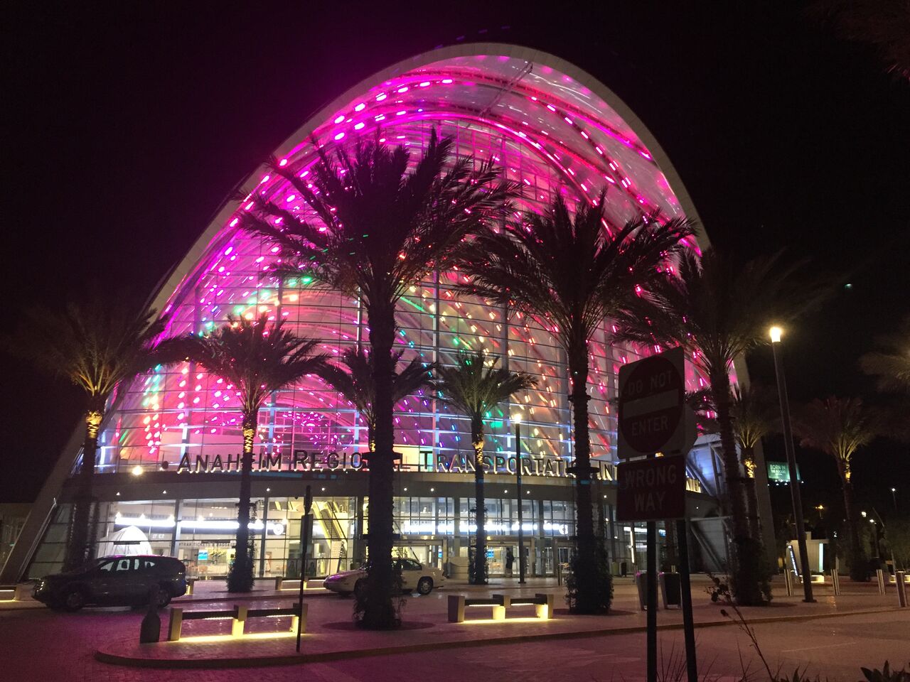
on top of it. If you drive at night, you will see the night version of it, a beautiful translucent structure illuminated in rainbow colors.

The Anaheim Regional Transportation Intermodal Center, known as “ARTIC”, is an intermodal transit center, and one of the most recent “green” building projects in Orange County. ARTIC is located between Honda Center and Angel Stadium of Anaheim, where is considered as a center of Anaheim. It links six different transportation facilities such as Amtrak, Metrolink, OCTA bus service, Anaheim Resort Transportation, Megabus.com and Greyhound.

The project was collaboratively done by HOK, Parsons Brinckerhoff , and BuroHappold Engineering in 2014, and for its great energy efficiency and outstanding design, ARTIC has achieved LEED Platinum certification, which is the highest level of certification in LEED, and other numerous awards such as United States Green Building Council Eco City Award, AIA Los Angeles Design Awards, and many more.

The building is structured with steel arches and covered with a 200,000-square-foot (about 4 1/2 Football Field) ethylene tetrafluoroethylene (ETFE) roof system, which diffuses sunlight to illuminate the interior space of the building through rice paper. ETFE is a lightweight
fluorine-based plastic with high corrosion resistance and strength over a wide temperature range, and considered as a sustainable material because it also has a high-energy radiation resistance properties and as a result, it is able to reduce heat gain while maximizing the light flooding into the center. It also helps lower the cost. This material has a lot of benefits in terms of environmental and economic consideration.

More interestingly, as briefly mentioned earlier, the building reveals its another look at night - 1,354 LED lights mounted on the diagrid structure illuminate the building in various colors. LED light bulbs are considered to be sustainable because they are extremely energy efficient and last long. For example, a LED bulb can cut energy consumption by over 80% compared to conventional light bulbs, and besides, it can last up to 25% longer. The use of LED light bulbs was really successful on this project because this simple yet unique shaped building shows the beauty of LED lights very effectively while saving energy and money.


 The entrance with 120-foot-tall glass curtain walls provides an open feeling and welcoming atmosphere. Exterior glazing at the north and south elevations have low-emissivity coatings which helps reflect unwanted sunlight in the infrared range and reject radiant heat captured by the glazing assembly itself.

After entering the building, you will notice that interior space of the building provides even more open feeling because you can see the sky through the roof. The interior space remains the sense of the exterior of the building: clean, light-scaled, and simple. There is a seating area around escalators that leads to the second floor. The chairs which bring natural texture to this minimal style space are from Grand Rapids Chair Company in Michigan, and the stainless steel outdoor tables are from Forms+Surfaces in California. The combination of the two gives a great modern harmony.

Beautiful shining terrazzo flooring is used throughout the whole building and gives clean looking to the space. Terrazzo is a sustainable material. It is a hard material composed of an aggregate and binder that has infinite design possibilities. Typically, terrazzo floors last the lifetime of the building, which is approximately 40 years.

In the restroom on the second floor, there are pretty, green-color-scheme tiles and white tiles with matte texture on the wall. They are put on the wall very well balanced: the green tiles fill up the negative space and white tiles line up very neatly remaining the cleanness, which is necessary in restrooms. Another flooring material, concrete, is used for outdoor space.


After all, this building is just fabulous both in architectural and interior perspectives. 
            ARTIC will continue to improve regional connectivity attracting people with its beautiful appearance and sustainability. You will be amazed by the great structure and how different it looks at night.

References:


Sunday, May 8, 2016

Oceans and Earth Restaurant, Yorba Linda, CA


Oceans and Earth Restaurant
Yorba Linda, CA
 Rebecca Koos


            My project was done at a new, family owned restaurant that was designed mostly by the owners and employees. I decorations are warm, creative, and beautiful, giving the restaurant a rustic and coastal feeling.  The flooring was a dark brown espresso color that hides dirt very well. My favorite part of the restaurant is the accent wall made of driftwood. I also loved how they did the lighting, with dimmers throughout the entire restaurant by using recessed fixtures. I feel that they did any amazing job incorporating everything into their theme, which is also the name of their restaurant. The booths are green to add a little bit of color, but do not overwhelm the setting. I think they did a great job to make this business look successful, and can’t wait to see how they add to it in years to come. 


Yard House

Yard House
Morghan Isenga

            This restaurant is close to home with entertaining happy hours offerings and a clean modern design. The facility has used multiple amounts of stained wood throughout the entire establishment. They have over 100 beer taps situated around a rustic concrete bar. Yard House also took it a step further by letting the customers be able to peer through large open style windows into their keg room. They made the room like a wine cellar but for your favorite beer!  
    
At the entrance, staff that is awaiting your arrival immediately greets you. A large desk makes it easy to locate staff for any questions you have.


The design of the multiple beer taps may give it a crowded feel at other bars, but here at Yard House they are situated along chrome backing giving a clean, easy-on-the-eye look.
                                                                                                                                               

The sign on the outside may be my favorite part. It is a typical restaurant sign but with an accent background that really shows off their name and artsy building. The lighted boxes really show power and give the feel of strength.

True Foods Kitchen

                                                         True Foods Kitchen                     
Linda Rocco


True Food Kitchen is a healthy eating collaboration between Dr. Andrew Weil and restaurateur Sam Fox. After spending time together in the late 1990’s, Sam Fox, head of Fox Restaurant Concepts, came to understand how delicious healthy food could be and realized that Dr. Weil’s concept for a restaurant that serves great food, that is in fact good for you, could work.  The first True Foods Kitchen opened in Phoenix Arizona in 2008 and was an immediate success. This success inspired Dr. Weil and Mr. Fox to open other locations in the southwest and make a long- range goal to expand across the country.  True Foods Kitchen opened in Newport Beach, California in August of 2010.

Dr. Andrew Weil, author, public speaker and Director of the Center for Integrative Medicine, advocates the Anti-Inflammatory diet. Many of the dishes at True Foods Kitchen, adheres to the principle of this diet. Dr. Weil’s vision encompassed a dining experience of delicious flavors, healthy nutrients, environmental awareness and an inviting natural atmosphere. He stated that no matter how many locations were ultimately established, he never wanted True Food Kitchen to feel like a “chain”.

The menu features fresh and healthy ingredients in creative dishes like edamame dumplings, spaghetti squash casserole,  curry and grass-fed bison burgers. There is also a stand alone bar that features unique non-alcoholic drinks such as the “Medicine Man” made with pomegranate, cranberry, black tea, soda and sea buckthorn. Most of the ingredients are sourced locally from two separate farms.

 Mr. Fox and Dr. Weil ultimately hired Testani Design Group of Scottsdale, Arizona to capture the essence of healthy and balanced living.  The “identity of the interiors” was created by mirroring the underlining ideas of “simple, fresh and pure”.   This concept was achieved by utilizing a color scheme that alternates between bright and warm colors combined with great attention to detail. The core design elements emphasized lighting and carefully selected materials. Splashes of green and yellow on the bar stools, banquettes, and chairs give a fresh and lively feeling. The airy outdoor patio boasts a contemporary crystal fire pit and brightly colored Adirondack chairs lining it’s perimeter. The open concept kitchen is integrated into the seating area of the main dining room and makes a strong design statement.
  
True Foods Kitchen exudes modern design and incorporates environmentally friendly materials, which reflect the natural and healthy eating focus. Among the eco-friendly applications used are reclaimed wood floors, recycled quarry tiles, and low VOC paint. Much of the equipment is also “green” including waterless urinals, ultra-low water faucets, and low voltage LED lighting. Some of the kitchen equipment is energy efficient and white oak butcher block that is sustainable and renewable as well as Caeserstone Quartz were also used. Additionally an Asian inspired sand garden and a living wall of succulents was tastefully incorporated in the décor. Wood and concrete used on the exterior provide a striking backdrop to the metal washtubs of herbs flanking the inviting entrance.

Unfortunately, the reputation of the brand was marred in 2014 by several patrons becoming ill after visiting the Newport Beach location. True Foods Kitchen was closed for a few days after the health department ultimately determined that no two patrons had eaten the same food and the illness was most likely passed on from person to person. The restaurant was ordered to close, all surfaces were to be sanitized and all food disposed of.  Staff that were working on the days in question were sent home and workers from other locations were brought in to replace them. Ultimately, the restaurant reopened quickly, everybody got back to work and True Foods Kitchen has maintained it’s outstanding reputation ever since.


Resources:

1.      Dr. Weil.com
2.      Nancy Luna/OC Register
3.      Testani Design Group


The Refinery at Saddleback Church

The Refinery at Saddleback Church
Lisa Guzman


Located in the heart of Lake Forest, The Refinery at Saddleback Church draws in a mix of young people and fresh faces with its sustainable and innovative design. The Refinery is a 45,000 square foot, two story building that includes a pizzeria, cafe, dining area, a state-of-the-art theatre, game rooms, an 800-seat auditorium, a full court basketball gymnasium, a half-court practice area, three classrooms and a multipurpose room for recreation and business meetings. The exterior of the building itself caught my attention, teal painted rusted steel and red brick covers the walls and found before the entrance a sign reads that the building earned LEED Gold. Of the exterior, a green roof was installed to prevent heat transfer and reduce air conditioning needs which is very efficient in saving cost. Low E glass is used throughout to prevent heat transfer into and out of the building while still allowing daylight to enter the building and reducing the need for artificial light. No stranger to the place, I always find myself amazed by how beautiful the building is and by the details that can be found all throughout the space. Throughout The Refinery, recycled materials used for the construction of the building could be seen. Youth Pastor, Doug Fields and Saddleback Church’s project coordinator, Brian Conner and Saddleback Development’s lead architect and Tim Loza, president and theme designer I believe did a wonderful job in including exposed steel beams and steel wall framing as part of the design, giving the interior space an industrial yet modern look. The beams were rusted and weathered which gave a very raw feel but the blue, yellow, and red walls and painted murals made the place feel cool, lively and inviting. Black barstools used for casual seating throughout the building gave a 60’s vibe mixed with reclaimed wood used for tables and counters.


Besides the classrooms, multipurpose rooms and auditorium, the space had an open concept which I love and as a mother, being able to see my child as he runs to play is very important and having an open concept gives that safe feel. Not missing a thing, I was able to stand on second floor and view the entire space of the first floor. To my surprise, the floor I was standing on, on the second floor happened to be made of recycled material as well.


When incorporating raw materials such as steel, wood, brick it can be a bit tricky especially when keeping children and young adults in mind but Doug Fields, Brian Conner, and Tim Loza did an absolutely amazing job. It does not feel like you are walking into an abandoned industrial warehouse but more so a fun and exciting place to get together and be in community with others. Kids are able to enjoy themselves and whether it is through video games, basketball, volleyball, shooting pool, or riding their skateboards so much is offered to them and it is apparent that the designers made children their top priority along with keeping the environment in mind.


Links

(All photos were shot and edited by myself)


Issara Thai Cuisine in Huntington Beach

Issara Thai Cuisine in Huntington Beach
Brooke Deniston
When you first walk into this medium sized Thai restaurant you will notice a beautiful accent wall of white stone to your right.  With track lighting aimed at the wall to highlight the stones textures so you can see all the beautiful colors and sparkly details.  As a contrast to the white stone the other walls are a pleasant deep red with matching red backrest on the booth benches that are soft and comfortable to the touch.  There are grey chairs and booth cushions that are quite comfortable to sit on and pleasing to the eye. 
 

 The air is cool and the scent of the fresh flowers throughout is a very lovely touch. The grey tiling on the floor gives a very clean look to the room.  The tile has texture and is slip resistant, the distressed texture throughout the tile hide wear.  The tables are made of strong dark wood with a shiny gloss top.  There is a wall divider with open abstract black squares between the hostess and the booths without blocking indirect sunlight. 

The food is prepared behind a wall with only a small window into the kitchen so not to distract from the clean lines and look of the dining area. The ceiling has panels that help with dampening sound, making for a nice atmosphere to eat and chat with your group. There are candles and a vase of beautiful fresh flowers on each table. They provide different types of fresh flowers on the tables every time you go there which is a nice idea as it changes often. Opposite of the stone wall  there is framed artwork of flowers of the same size and distance from each other. The overall design with clean lines and contrasting colors is pleasant to the eye and the attention to the details really give it the personal touch that fit very well with the theme of the restaurant. 


Submarine Crab

Nichole Xa

Submarine Crab is a cajun-style seafood restaurant that first opened up on January 25th, 2014. The first thing I notice is just below the ceiling line are copper pipe lines surrounding the entire interior and I thought it was a great accent to remind the customers of an old-fashioned submarine. Don’t forget the copper lighting fixtures. Another reminder of a submarine is the metal circle with a plastic cover in the inner circle created to look like a submarine window mounted on top of a horizontal wooden plank. Also, beneath that is a wallpaper that matches the wooden plank colour. As your eyes roll from the top of the ceiling and then mid-section of the wall to the bottom are these yellow vertical wooden panels called MDF Panel. Next, the hardwood floors match the same patterns as the wooden tables that compliments the metal seatings. Lastly, the reception area to the customer’s eyes has porcelain 4x4 tiles and as your eyes level up then you see a solid gray granite countertops with a background of bright yellow paint. Overall, I, myself really enjoy the interior design and thought it was a very simple; yet, very effect design to it’s purpose as submarine. Thank you for taking the time to read my article and I hope it was visually enjoyable.


Yogurtland

By: Monique Herrero
Yogurt land is a smaller location due to the product they sell. Their design is fun, memorable and makes you feel the need to buy their product. Their product is ice cream yogurt. Yogurt land’s clientele are those whom want to maintain a healthy desert. Keeping this in mind the design really reflects what they are selling. The color palette within the local resembles the colors of land also linked to the name. One of the colors is shown through mosaic tiles on the wall where you choose the yogurt of your choice. Not only did the color pallet show the “land” aspect within the name but also green is a reminder of healthy products that are grown on land. We also see curved lines bringing a tranquil environment where it is inviting you to come in.


The fruit on the wall is in a translucent material acting as a wall cover to give the customer a sense of taste to what they are going to consume. The flooring is a porcelain tile being a durable and easy cleaning material since it is a commercial store where there are a lot of people coming in and out. The color of the floor not only resembles the color of nature being the same color pallet, greys, browns, and greens.


Here in yogurt land we can see how the colors are maintained throughout the whole store. Glass is being used to protect the ingredients what you can mix with your yogurt but at the same time allows you to see them. The back wall is a light brown color so it would disturb your eyesight to the ingredients you are selecting.


Twitter Delicious Facebook Digg Stumbleupon Favorites More

 
Powered by Blogger